Wednesday, December 2, 2015

Our Norman Rockwell Christmas Card: Going and Coming

Hopefully everyone has received their Christmas cards from us so now I can share the "magic" behind the image.  And by magic, I mean pure photoshop trickery;)


Here is the image of the original Norman Rockwell painting that we wanted to imitate:

Since our Honda Pilot only has 2 working windows per side (and because of our crazy carseats) we had to create our image from 6 different shots.  As follows:
The "Going" pictures

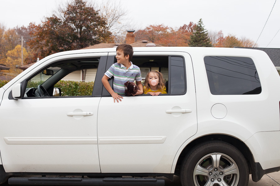
This image I used the quick selection tool and trimmed it down to fit in that little rear window.

To come out with this: 
( I used some retro photoshop actions to make this look more like the coloring in a Rockwell but toned it down in our final image.)

and the "Coming" :
I forgot to reverse the car before I took this shot and I wasn't going to even attempt putting those two back in the car to shoot again so I just flipped this image and used it as my base for the front and rear window quick selections.

At this point in the shooting I realized I hadn't reversed the car yet so we backed it into Oma's driveway to make it more authentic;)

Same thing as the first set of images, I had to quick select the middle window and trim it down to fit in the rear window of the main car image I had chosen.


At this point I didn't even bother saving the "coming home" image and instead just merged the top and bottom to mimic the Rockwell paining.  Adjusted the brightness on the bottom image to make it look more like it was nightfall and ran some actions to give it a more retro feel.


I added a type layer for all the wording and then I had to add in a digital rosary because we had forgotten to put it back up after out last road trip.  It wouldn't be authentically our family without the rosary on the rearview so it was worth the extra step:)  All in all I am really happy with how it turned out.  We tried to add in some of our own ideas to make the photo a little more "our generation" (coffee instead of cigar) but tried our best to stay true to Mr. Rockwell's original idea.  Here's to the joy of the Great Family Roadtrip!  Merry Christmas from ours to yours:)

Sunday, September 8, 2013

2013 Fall Family Pictures

2013 Fall Family Pictures

Old Navy dress
oldnavy.gap.com

Mossimo sweater
target.com

Old Navy clothing
oldnavy.gap.com

Old Navy blue skirt
oldnavy.gap.com

Old Navy scarve
oldnavy.gap.com

MINI A TURE Bibo Dungarees
$30 - littlebou.co.uk

Sunday, August 11, 2013

A love affair with The Organic Bloom frames

Even before I had my vendor's license I crushed pretty hard on these frames.  They are so unique and beautiful and I admired the team of people that stood behind the company.  So naturally as soon as I set my business up with a tax ID and my license to sell I applied for an account with Organic Bloom.  Needless to say I was pretty excited when I was approved.  I wanted the frames to become a big part of my packages but I wasn't quite sure how to get my clients to imagine the frames in their home.  Since I run my business out of my home I decided that I had to show the frames in action in my own home.  I started small with several 8x10's adorning the wall of my studio.  I displayed all different colors and sizes but I think it was hard for clients to imagine how to create something similar in their home and I wasn't able to show off how beautiful the BIG frames are.  I continued to slowly add to my home's collection with smaller frames in my living areas that would also be seen by clients during my sessions.


I already had 3 of the frames displayed in my den but I decided, during an end of the month sale on ready to ship frames, that it was time to shake things up.  And I was ready to go BIG.


I went with a white 20x30 inch fonzie frame and I love it.  I didn't want to put a big family picture in it because my home is already saturated with pictures of  my loved ones so I created my own image in Photoshop of my favorite words on a faux chalkboard background.  I like it because it is simple and the colors are neutral enough that it isn't too bold, despite its large size.


I then focused on my main wall, which is also what the parents of my newborn clients sit in front of while I'm snapping away in my studio.  I wanted to show the versatility of the frames and that you don't have to have a perfectly symmetrical/color matching/same style set of frames.  I started with several frames I already owned and then threw in my new purchases.  I went with the colors of white, parchment and gray, with sizes ranging from ornament to 16x20 and a smattering of different styles.


I picked old and new photos, different editing styles and threw in some favorite quotes and personalized prints.  (Courtesy of some pinterest finds and using photoshop to make the faux chalkboard backgrounds and text images).  I didn't have an imagined layout when we started.  I had my oldest son help me lay things out on the floor and then we shuffled things around until I found something that looked right.  Then I just eyeballed where they should go on the wall (hence why there are many extra holes in my wall now), made a few adjustments and voila!


I couldn't be happier with how everything turned out and I'm so excited to help my clients create their own "wallscapes"!